Context
Best Wallet is a crypto wallet product within the ClickOut Media ecosystem, competing in a space where trust, speed, and clarity are everything. Users arriving from search are high-intent but sceptical — they need to find what they're looking for instantly and feel confident in the product before taking any action.
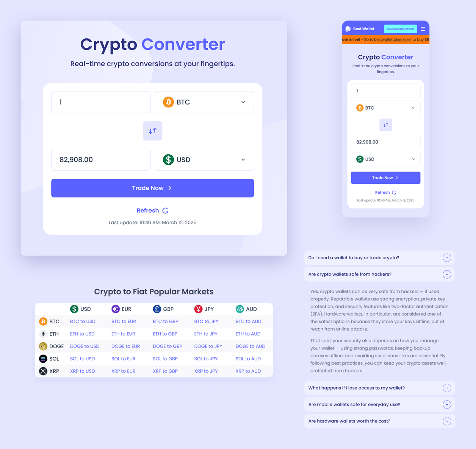
As part of an initiative to improve the site's organic authority and usefulness, I identified an opportunity to design a native crypto-to-fiat converter — a high-volume search feature that most competitors handled poorly.
Another part of the challenge was designing something that felt trustworthy enough to use for financial decisions, and simple enough that the primary conversion (calculator → account creation) felt natural, not forced.
My Role
I owned this project end to end. I conducted competitor research, defined the feature scope and UX logic, designed all components and interactions, and delivered the full page template ready for engineering handoff. I worked autonomously throughout.
The Opportunity
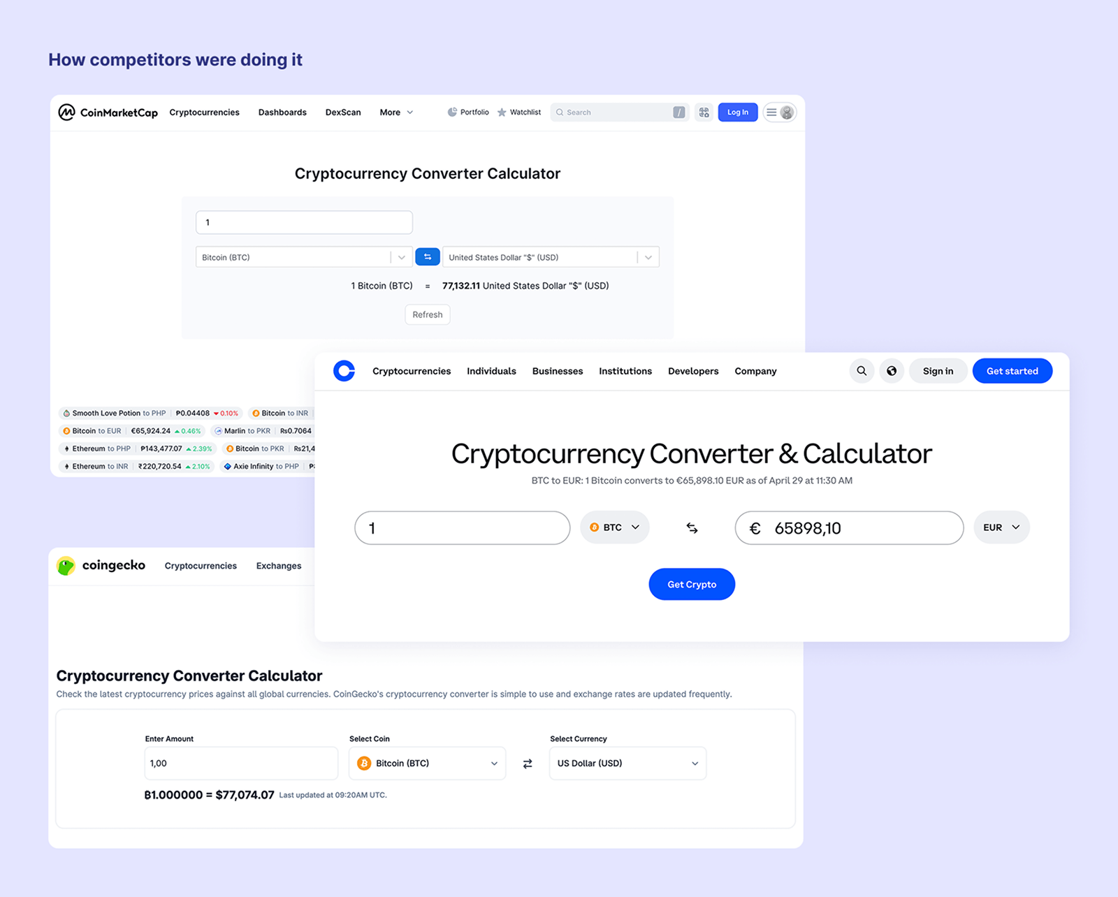
Crypto converter queries are among the most searched terms in the crypto space. After reviewing how competitors handled this — from cluttered interfaces to basic input fields with no supporting content — it was clear there was room to do it better.
The opportunity wasn't just to build a calculator. It was to build a page that served multiple goals at once: provide genuine utility, capture SEO traffic through popular conversion pairs, and guide users toward creating an account. All without feeling like a conversion funnel.
The Design Challenges
Three things needed to work together, and that tension is where the interesting design decisions happened.
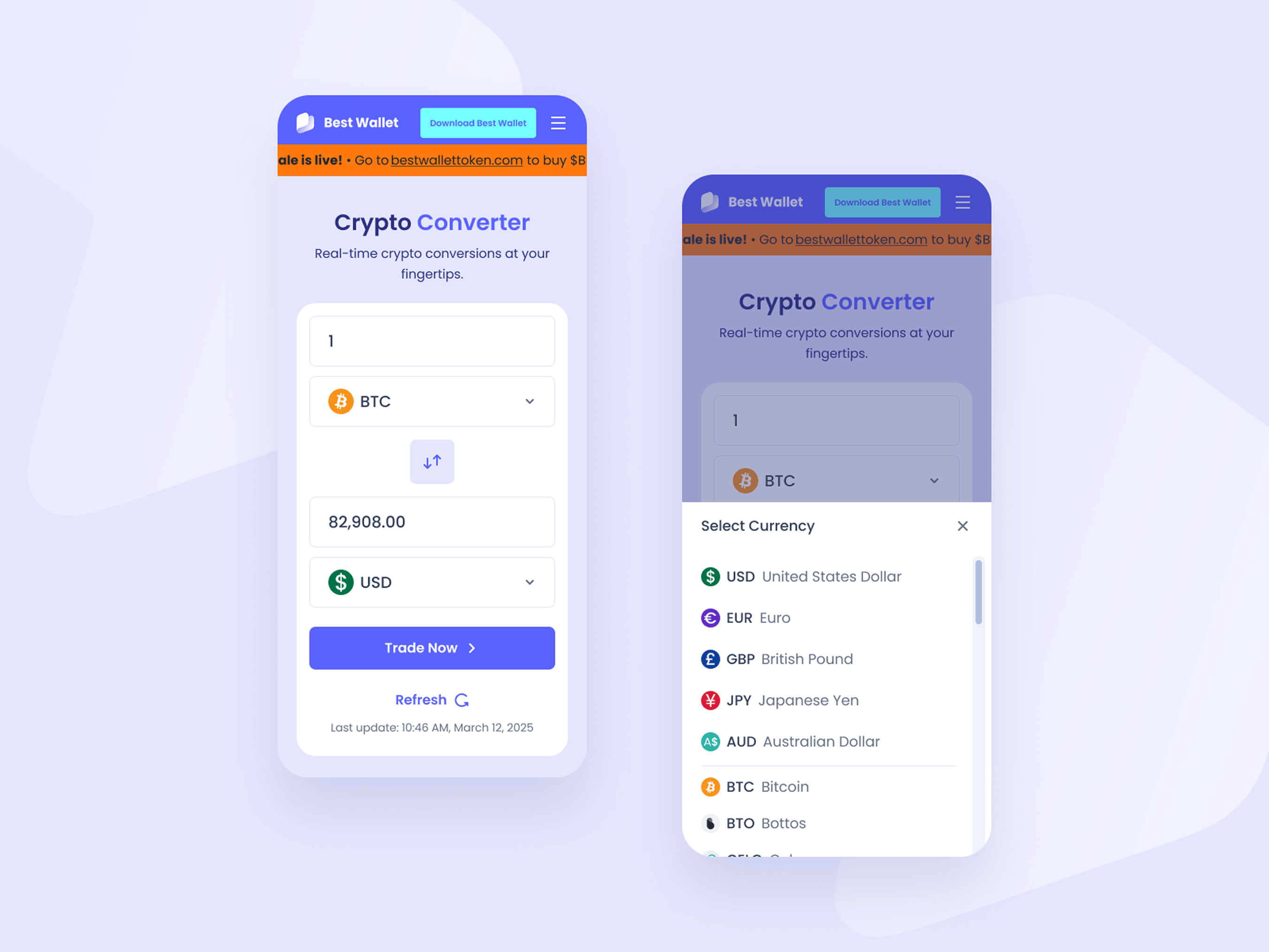
- Utility first. The calculator had to be genuinely useful: real-time rates, clean input logic, instant swap between crypto and fiat, and a wide range of supported currencies. The currency selector modal needed to handle a large list without feeling overwhelming, so fiat currencies were separated from crypto with clear visual hierarchy and search functionality.
- SEO without feeling like SEO. The popular markets tables (crypto to fiat and fiat to crypto) needed to be scannable, linkable, and genuinely informative. The design keeps them clean and tabular without feeling like a data dump. Each pair is a potential entry point from search.
- Conversion without pressure. The onboarding steps section (Create an Account, Connect Funding Method, Convert Crypto) had to sit naturally within the page flow — not as a hard push, but as a logical next step for someone who just used the calculator and wanted to act on the result.
The Solution
The page was structured as a single focused flow, top to bottom:
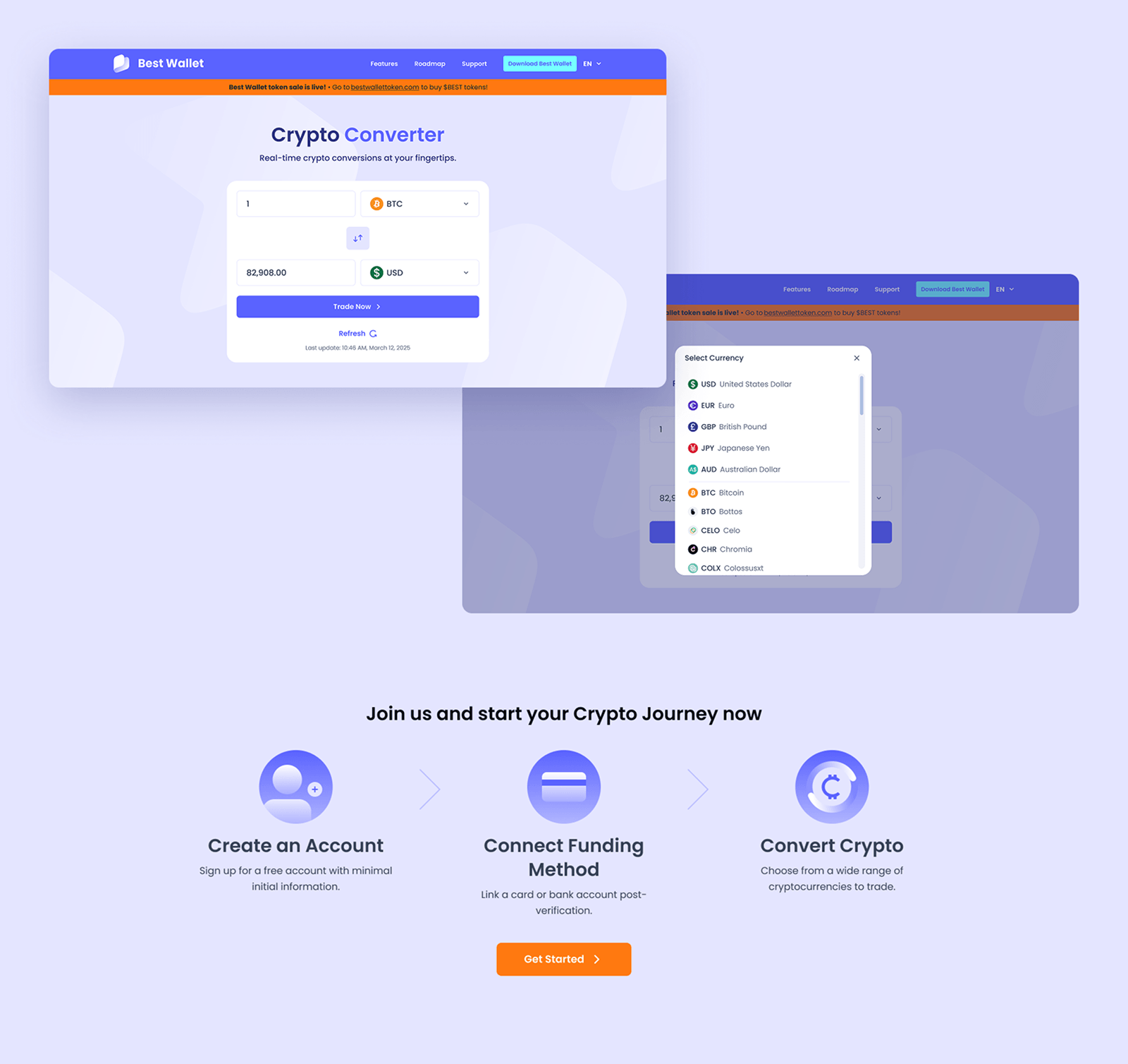
- The calculator sits above the fold, immediately usable with no friction. One input, one output, a swap button, a live refresh indicator, and a single clear CTA. Nothing unnecessary.
- Below the fold, the popular markets tables serve double duty — SEO value for high-intent queries and a reference tool for users exploring conversion rates across currencies.
- The onboarding section follows naturally, contextualised by the calculator above it. By the time a user reaches it, they've already used the product.
- FAQs and tutorials close the page, addressing trust objections and providing additional SEO-indexed content.
- On mobile, the layout stacks cleanly with the calculator taking full width, the currency selector as a bottom-sheet modal, and all sections reordered for thumb-friendly scrolling.
Component Design
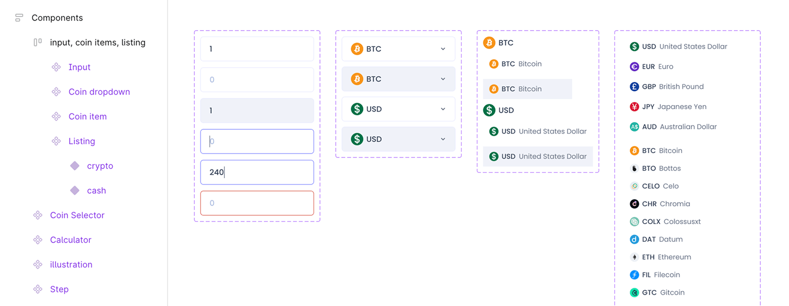
The calculator component was designed as a self-contained, reusable module: input fields, currency dropdowns with icon support, a swap toggle, live rate display, refresh timestamp, and a primary CTA. The currency selector modal supports both search and browsing, with fiat and crypto separated by a clear divider. All states (default, hover, active, loading, empty) were designed and documented for engineering.
The Results
Delivered a fully designed, responsive page template covering the calculator feature, SEO-optimised popular markets tables, onboarding flow, FAQ section, and tutorial module — all built on the existing Best Wallet design system.
The page was designed to serve three goals simultaneously: drive organic traffic through high-intent crypto conversion queries, provide genuine utility to users already on the site, and support account creation through contextual, non-intrusive conversion touchpoints.
Because I designed this as a self-contained component with configurable currency pairs and a modular results display, it was later embedded in editorial pages. This translated into different results:
- Organic traffic ↑12% within 3 months.
- Embedded across 14 editorial pages within 1 month of launch.
- Average session time on calculator pages: 2 mins.
- 4.1% of calculator users went on to create an account.
What I Would Do Differently
Without access to post-launch data, it's hard to know how the SEO tables performed or whether the onboarding placement drove meaningful conversions. If I were to revisit this, I would push for tracking from day one — even basic metrics like time on page, CTA click rate, and organic entry points — to validate the design decisions and iterate from real data rather than assumptions.