The Problem
ClickOut Media is an international affiliate marketing company reaching 50M+ monthly users across crypto, finance, and tech publications. When I joined, the company had two separate logos, two websites, and no unified visual language — a fragmented identity that didn't reflect the scale or ambition of the business. This created three compounding issues:
- Trust: Partners and affiliates landing on different ClickOut products felt like they were dealing with different companies, which affected clarity and trust.
- Speed: Designers were spending time on solved problems instead of new ones.
- Scalability: With continuous growth and new products planned, the company couldn't afford to keep scaling this way.
The brief was clear: build one brand. Cohesive, scalable, and bold enough to hold up across every touchpoint — from the main website to the affiliate platform, social media, internal decks, and beyond.
The brief I gave myself wasn't "make it look consistent." It was: build a system that survives.
My Role
I led this project end-to-end as the sole designer, from initial strategy and exploration through to execution and company-wide rollout. This included defining the new brand identity, building the design system and brand guidelines, designing the website, updating the affiliate platform, and creating the full suite of cross-platform assets. I worked directly with the Head of Design and the marketing and engineering leads. I made the final decisions on visual direction, and I was responsible for getting buy-in from teams who had been working without a shared system for years.
The Strategy
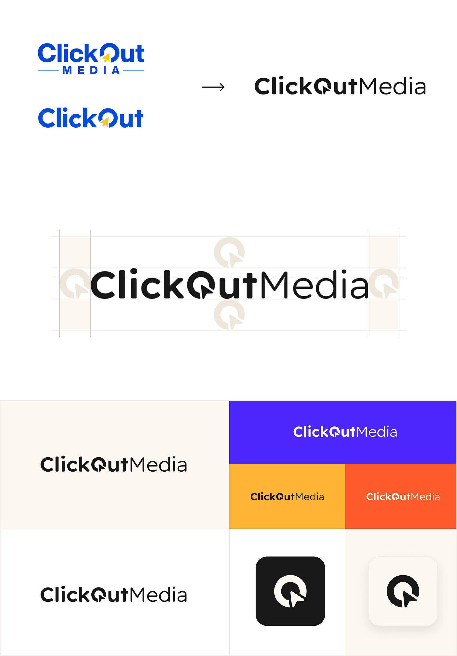
The goal was to make the brand feel bolder, sharper and future-proofed. I moved the identity away from looking like an outdated, small affiliate network towards a "Global Media" look. This meant:
- One Logo: I cleaned up the logo to make it simpler and easier to read.
- A modern and contemporary visual system with strong foundations and recognisable identity.
- A Design System, easily scalable and with strong foundations.
- Brand Guidelines, aimed for everyone in the company, giving them the ability to translate any business requirement in line with our brand.
- Brand collateral and assets for all employees, ready to use and implement.
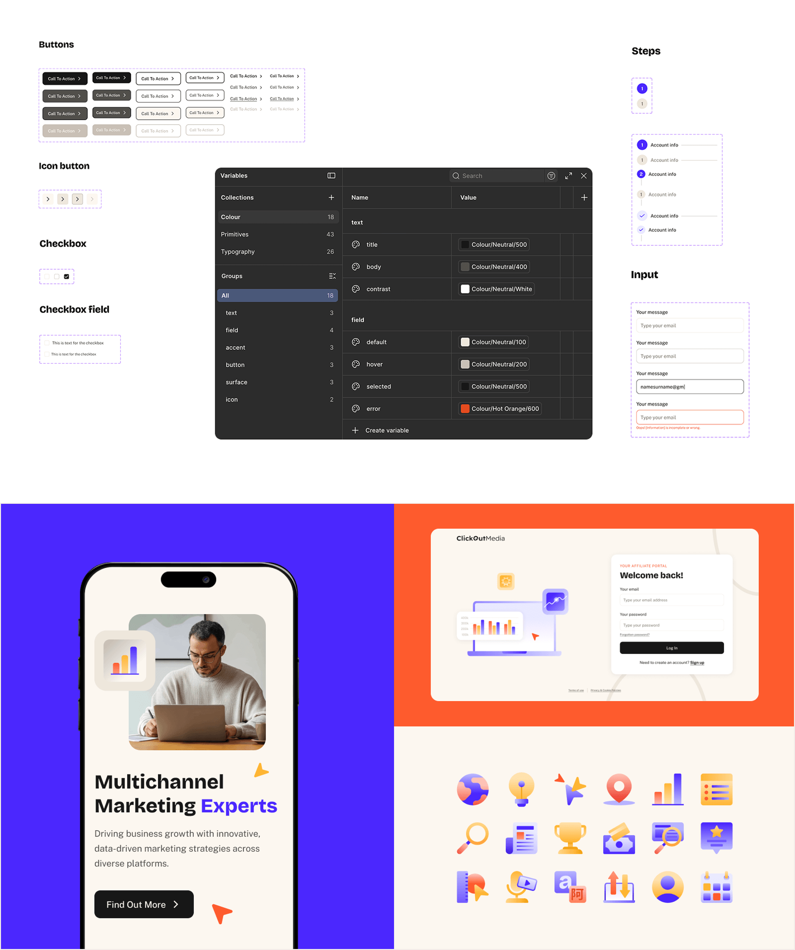
The Design System
Beyond the identity, the project required a full visual system that teams could use day to day. The system was built to scale — clear enough that anyone on the team could apply it correctly, flexible enough to work across web, social, email and print. It included:
- Foundations: colour tokens, variables, typography scale, spacing system, shadow and elevation scale.
- Components: core components covering navigation, forms, data display, feedback states.
- Patterns: page templates for the main product types we shipped.
- Documentation: usage guidelines written for the different end users who will interact with our brand.
- Visual assets: a large set to be used across our products, including custom iconography, illustrations, organic line elements, and graphics system.
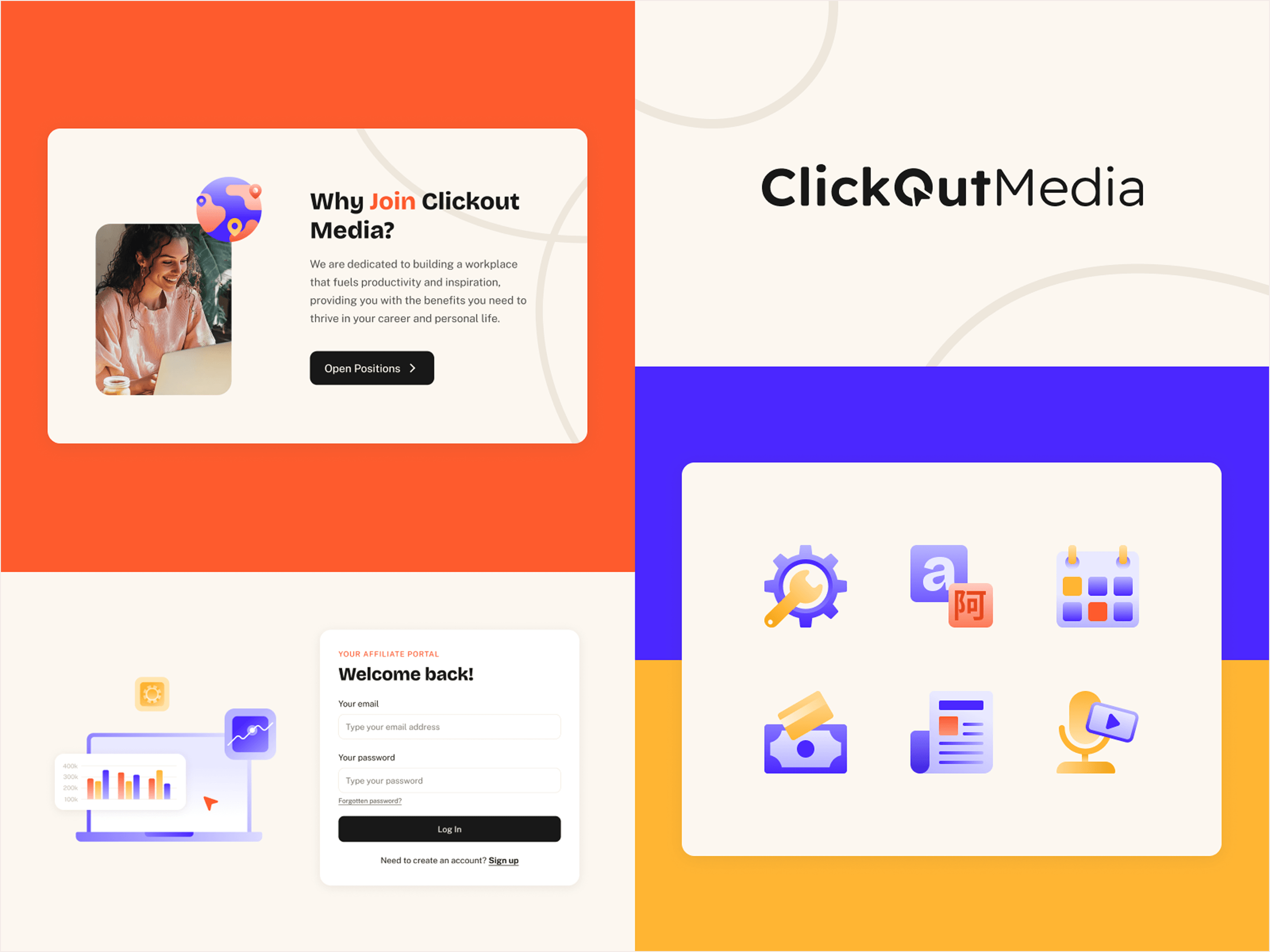
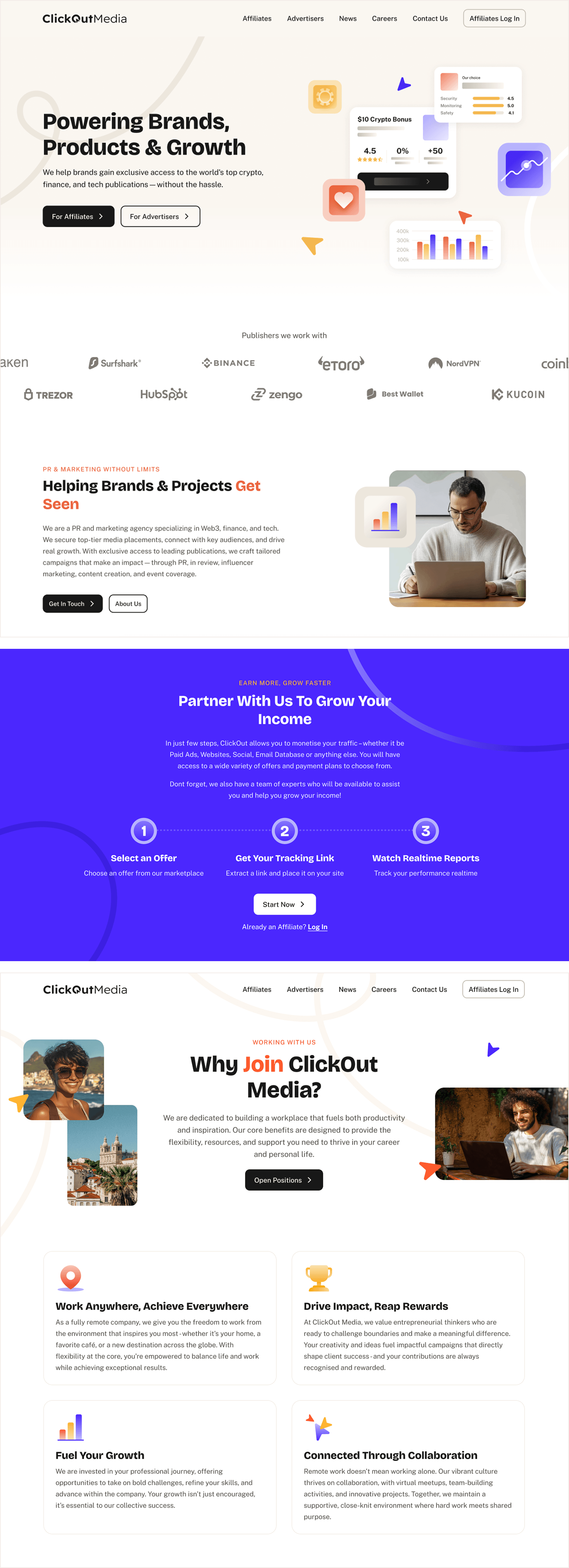
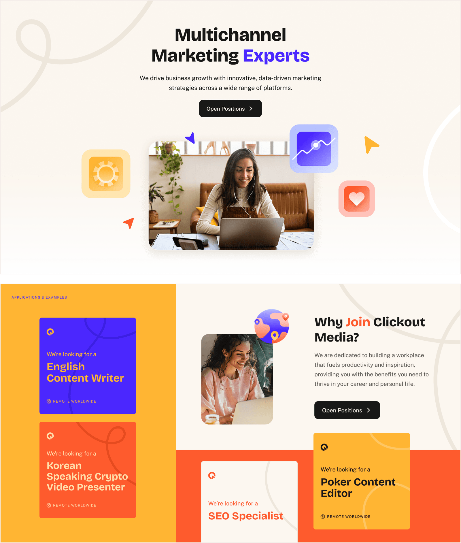
The Website & Affiliate Platform Redesign
The website was reimagined with a remarkable interface, combining the different elements of our new brand to bring it to life — bold and clean colour, strong and clear typography, modern illustrations, custom iconography and organic lines.
The new design included asymmetrical and fluid layouts that create a sense of movement, flow and depth.
We moved towards a single website, which aligns all our sources into a unified brand and site, giving users a global understanding of who we are, what we do and what it means to be part of the business.
The affiliate platform UI was updated to align with the new visual identity — bringing the same colour system, typography and component language into the logged-in experience, so the brand felt consistent from first impression to daily use.
A Rollout Made for Everyone
This brand was built to be used by everyone in a simple and straightforward way. Not only for the product design team, but also having in mind every employee and aspect of our new brand. I rolled out new tools, assets, templates, and resources to make the transition simple, in shared folders easily reachable. Those included:
- Easy-to-follow brand guidelines.
- Ready-to-use folders with all the new logos, icons and visual assets.
- New templates for Google Slides and email signatures.
The Results
The new brand was successfully rolled out across all platforms, ready to use and implement in a seamless and smooth way.
- Unified two fragmented brand identities into a single cohesive visual system, rolled out across all company touchpoints.
- Designed and launched a new website replacing two separate platforms, serving a company with 50M+ monthly users and 200+ media partners.
- Built a complete design system and brand guidelines adopted across the full team, from product and marketing to external communications.
- Designed a library of components used across all our products.
- Updated the affiliate platform UI to align with the new brand, improving consistency across the product ecosystem.
- Created a full suite of cross-platform assets including social templates, email signatures, internal decks and presentation templates.
- Design review cycles for marketing assets were shortened by an average of 60%.