Context
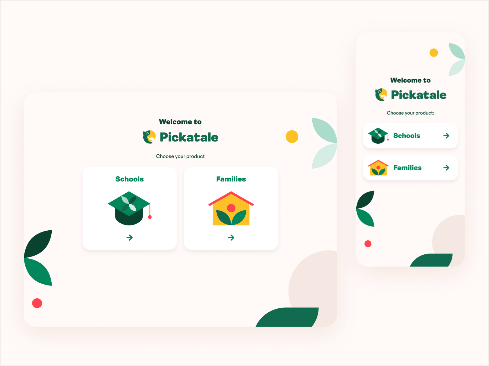
Pickatale is a digital reading app for kids. operating in Norway, Denmark, Sweden and the UK. Is primarily directed at schools to use as a a reinforcement for kids reading, but also available for families to support their children.
As Pickatale expanded its platform and content library, the visual language needed to be standardised and updated to ensure a coherent and recognisable brand experience.
The app, the website, and the internal content tool looked and felt different from each other. There was no design system, no shared component library, and no brand guidelines that anyone had written down.
The challenge was to create a flexible yet structured design system that could support product development while remaining aligned with the brand's playful and educational personality.
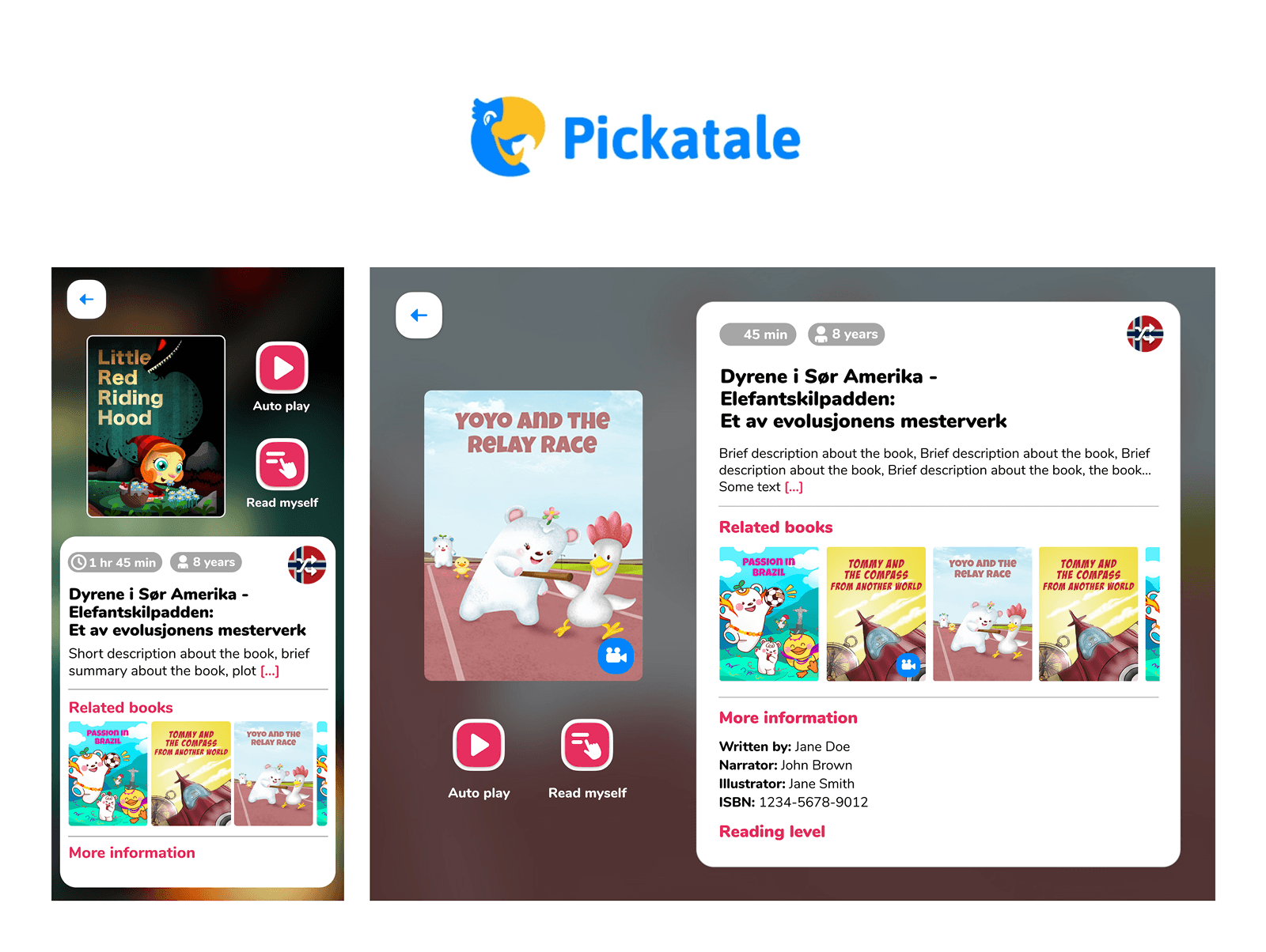
Below is an image with their old logo and shots of their app.
My Role
My role was to fix all of that simultaneously, while also shipping product improvements that would move retention and subscription metrics. That meant I couldn't spend six months building a perfect system before shipping anything. I had to build the system and improve the product at the same time.
That constraint shaped every decision I made.
Led the completion and whole cycle of this challenge, with support from the CPO and UX lead. I guided the obtained results and produced all guidelines and hands-on work. Meanwhile I sourced an artist, instructing and collaborating on our illustrations and mascot, and also managed asset production. All of this was done while taking care of the new website, product updates, and UX improvements along the brand launch.
The Problem
There were several areas that needed attention, with the main issues including:
- Outdated and unmemorable brand personality, which was to be solved through a rebrand.
- A recent rebrand that was uncompleted, which provided an unfinished logo and some colour explorations.
- Accessibility issues in their digital products.
- No clear guidelines or visual system, damaging consistency.
- Website didn't respond to current business needs.
- Separate branding for schools and consumer, which made it confusing.
- All of this needed to be done in a very short timeframe to launch our new brand along with our updated and refreshed products.
The goal wasn't aesthetic consistency for its own sake. It was building a foundation that made future product work faster and made the brand feel as trustworthy as the content.
The Goals
- Create a new brand, aligned with their growth and supporting a premium image, yet kind and friendly for kids.
- Establish clear brand guidelines to support business expansion, for all team members to create new designs, components, product iterations, assets or brand collateral.
- Create a scalable design system for their digital products.
- Improve collaboration between design and development teams.
- Strong foundations to create a seamless experience.
- Refresh our products in a timely and efficient manner.
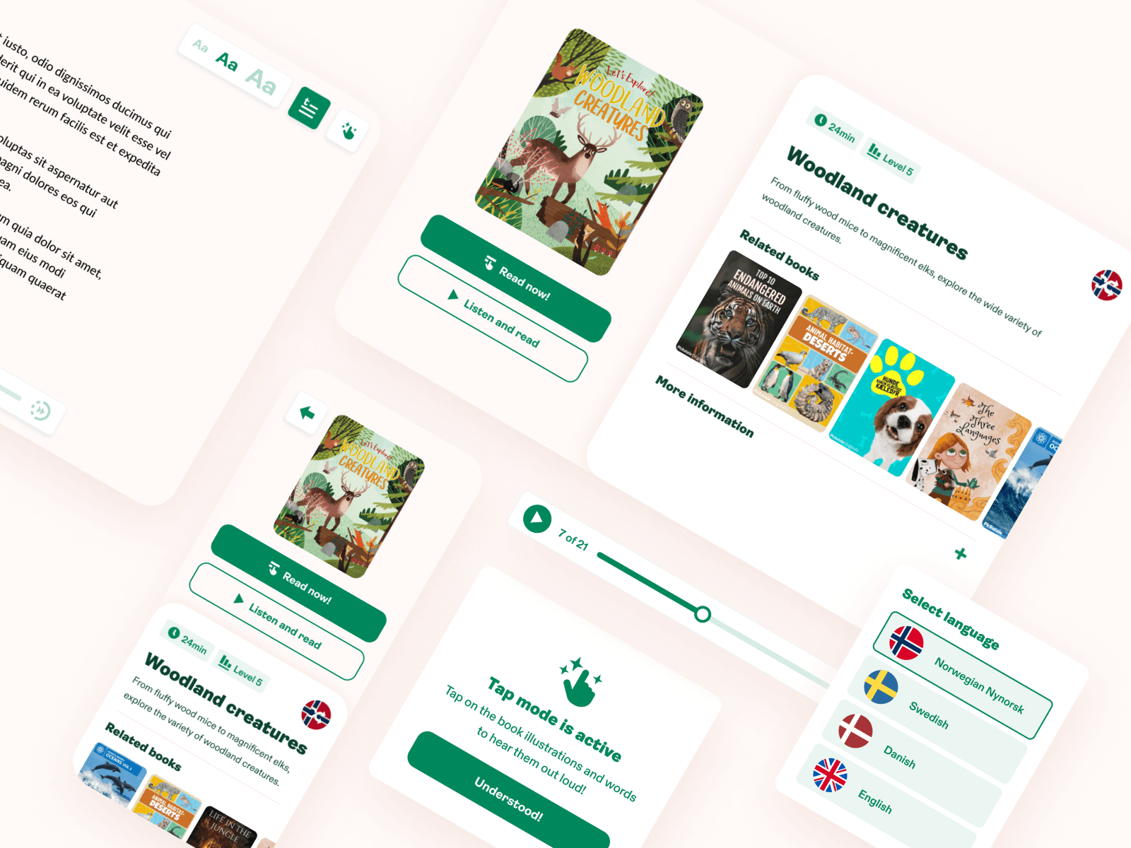
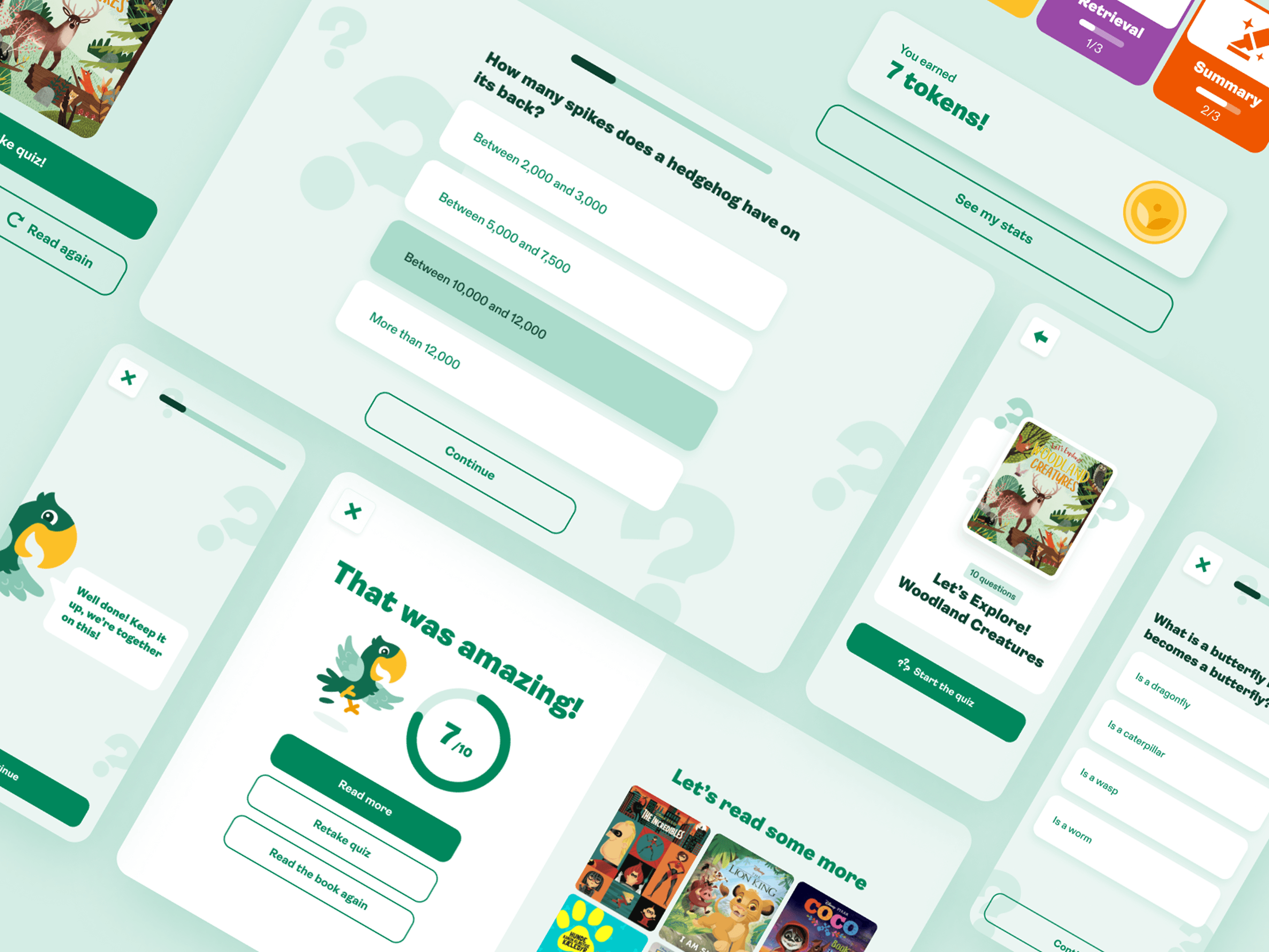
- Take care of the most urgent product screens/features, aligning our new brand with improvements in usability.
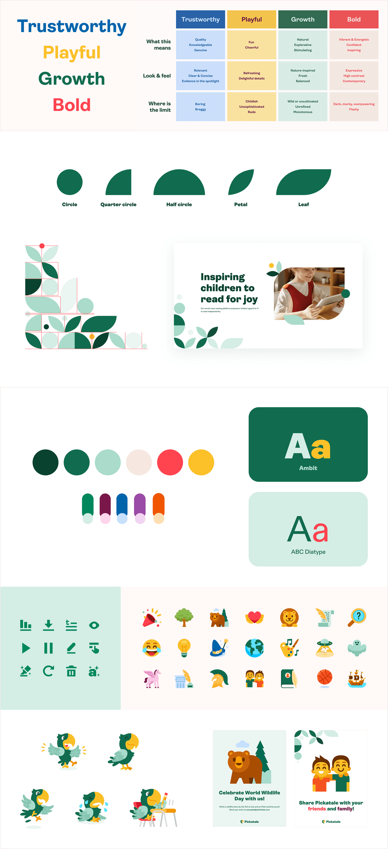
Creating a Consistent Visual Language
The brand needed to have strong principles as a whole, with clear rules and do's and don'ts, examples and how to be applied in every platform.
This would translate in a big impact for all teams, specially the product and marketing teams, saving time and effort on a seamless product experience.
Those included:
- Core narrative
- Guidelines for all brand elements (font, colour, pattern, etc.)
- Illustration sets
- Mascot strategy and tone of voice
- Iconography
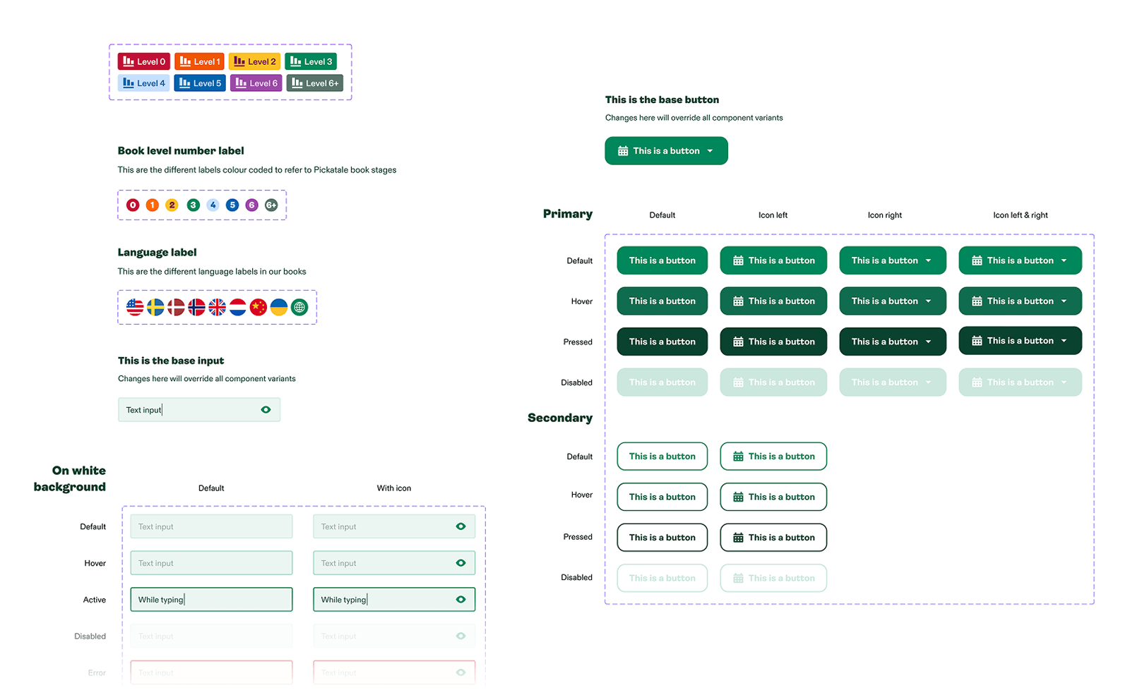
Structure
The old product and brand had a seamless structure, so we took action and constructed libraries, styles and components.
We followed a consistent methodology for file organisation, covering all different products using the same language and logic. The covered areas included:
- Libraries and files organisation
- A scalable design system
- Components and variants
- Brand Guidelines
Design System
Building a design system is not the hard part. Getting it adopted is. I made some decisions that helped:
I built the system mainly using patterns that were already in the product, so I didn't impose new patterns and ask people to change everything overnight. This reduced engineering resistance significantly.
I shipped the system changes incrementally, not as a single "design system launch." Every sprint, the relevant components were updated. By the time the full system was complete, most of it was already in production.
I added different layers to support this: foundations, core components, platform-specific variants and documentation.
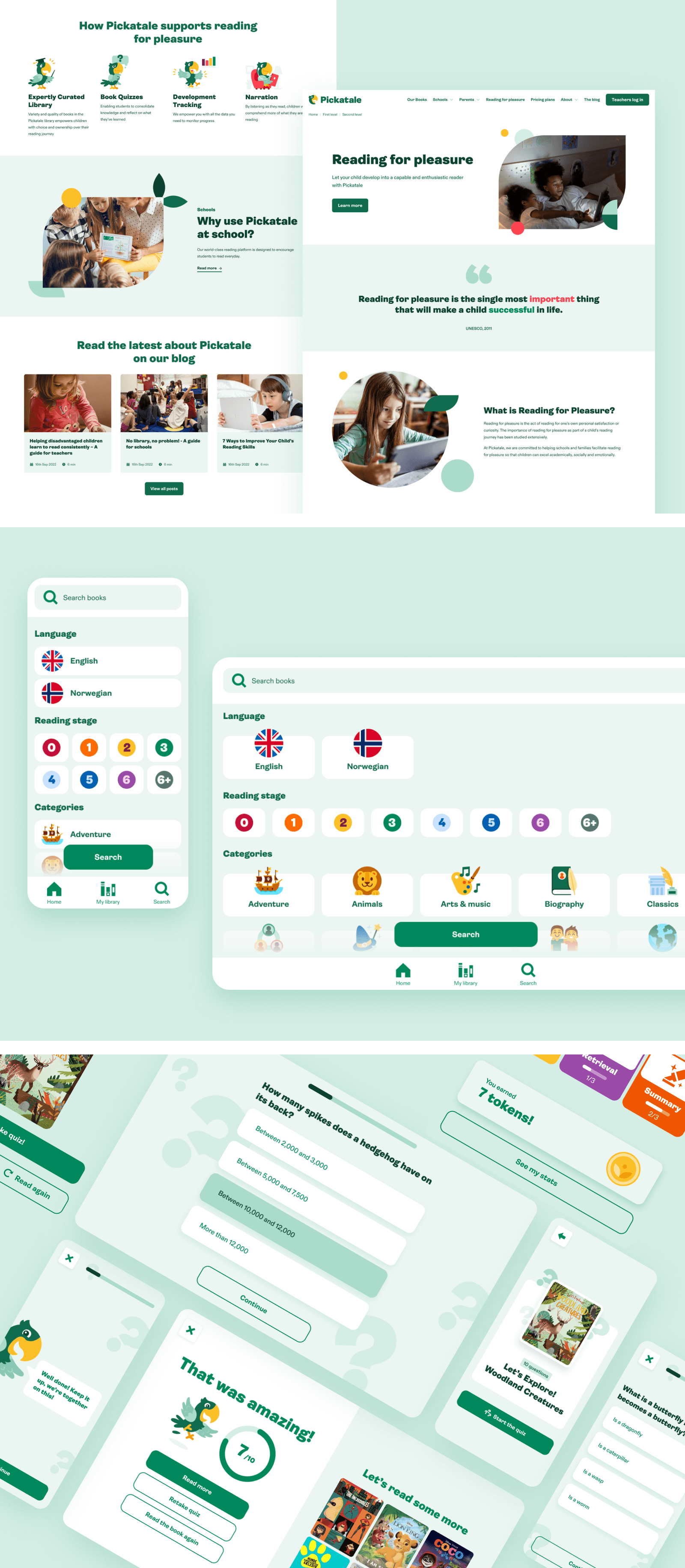
Refreshing Our Products
The old product and brand had a seamless structure, so we took action and constructed libraries, styles and components.
We followed a consistent methodology for file organisation, covering all different products using the same language and logic. The covered areas included:
- Libraries and files organisation
- A scalable design system
- Components and variants
The Results
Our new brand, website and products created a whole new experience, with strong foundations for the company and very positive results.
Brand
- Helped our team on the alignment creation of assets and collateral.
- Was produced on a timely manner for launch.
- Differentiated from our competitors.
- Boosted the attraction of new customers.
Website
- Visits to the website increased by 2.3×.
- Average time on page increased from 14.7 to 32.4 seconds.
- Bounce rate decreased from 57% to 43%.
- Amount of pages visited increased from 2 to 5.
- Different pages visits oriented to growth increased by 2.1×.
Product Updates + Enhancements
- The refreshed look made our products more desirable for potential and existing users.
- The additional and improved features caused more curiosity in schools, driving an increased 2.7× conversion rate in sales.
- Usability improved, and kids experienced a better product.
- Accessibility was met at AA level.